You think you could do more writing or comic creating posts or stuff like what bad webcomics are doing wrong vs what good webcomics are doing right? Your last post about defining webcomics was pretty cool and you seem like you know what you’re talking about.
I’ll try to come up with something, but here’s one that’s been on my mind


I’ve only started reading Octopus Pie recently, so I can’t honestly say how good it is. It strikes me as a Slice-of-life-y hipster romance webcomic (which may just be the last ten pages or so, I dunno), so I keep comparing it in my head to Questionable Content.

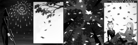
(If Tumblr made the Octopus Pie comic blurry, click here for it).
The first thing you’ll notice about the two Octopus Pie pages here is that one’s a lot taller than the other. The second one looks like it’s exactly 2 normal pages tall (presumably for ease of print). This is one of those uses of Infinite Canvas I didn’t think to mention. Each page of Octopus Pie seems like it’s exactly as long as it needs to be, as opposed to taking a pre-existing format and trying to jam a story into it, even when that means breaking up the story in sub-optimal ways
UnrelatedImage.jpg
The other thing that’s immediately noticable comparing Octopus Pie with QC (or with most webcomics), is the “camerawork”. Compare the two silent strips above. I’ll put them here again

I have no idea what the context of this is. Like, I literally don’t; I haven’t read the comic. I do know the context of the QC one. But the Octopus Pie hits me a lot harder, because of how it’s put together. It’s hard to put into words why, but do I even have to? Look at it! It’s beautiful. It’s an interesting location. The camera shots are all interesting. Everyone’s doing an interesting this. And there are details! I hear the water splashing in panel 4 in a way I don’t normally hear things. I hear the seagulls, and there aren’t even any seagulls in the page. And I think part of it is just because this page isn’t obvious. It demands I pay more attention to it, and rewards me for doing so. This is a great fucking page.
And yes, the fact that the art is good helps a lot, but just the decision-making of the frame, the scene, the time. There’s even the playground there to make the setting less generic than just “beach at sunset for an arty shot”.
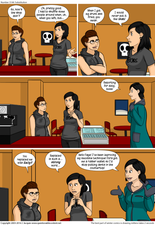
Everything here is stiff and flat. Let’s break the “camerawork” by panel. One of these is the Octopus Pie comic. Once is Questionable Content. Can you tell which one is which?
COMIC A
1. Extreme close up
2. Establishing shot
3. Full Shot
4. Mid shot
5. Mid shot
6. Close up
7. Close up
COMIC B
1. Medium shot at eye level.
2. Medium shot at eye level.
3. Medium shot at eye level.
4. Medium shot at eye level.
5. Medium shot at eye level.
The QC comic is supposed to be the emotional payoff of a story line, but it’s “shot” like Garfield!

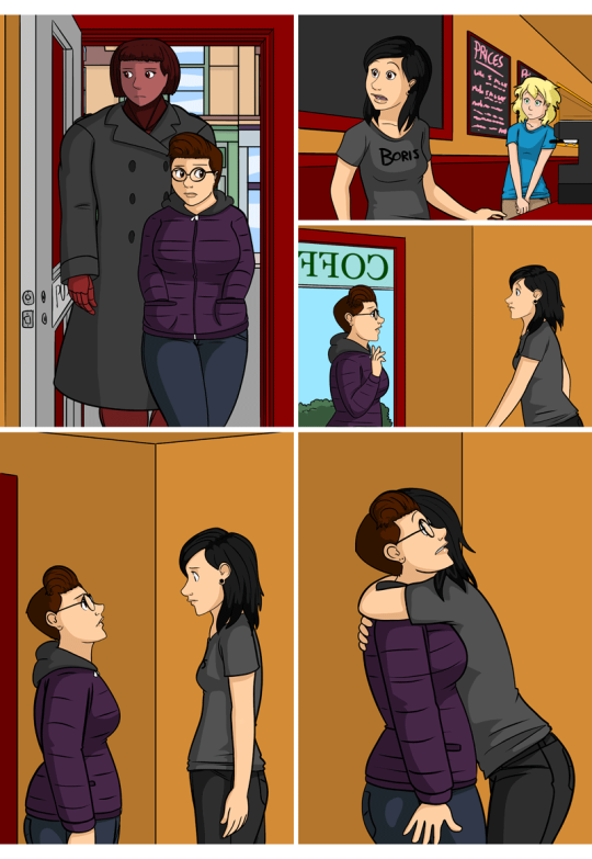
Even Alice Grove, which is a Sci-Fi action comic, still badly overuses medium shots, making these high-speed superpowered action scenes seem flat and boring.

In Fairness, Alice Grove is a little more varied from QC, but it feels like Jeph Jacques will use the middle shot and close up pretty much exclusively unless he has a very specific reason not to.

But that frame of mind can keep you from making interesting choices, like this giant frame with no background.