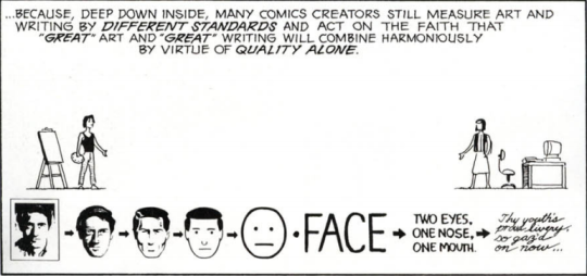
What is “Good Art”?
A thing that I have noticed is that a lot of webcomic dont use the art as tool for storytelling, there’s so much one can do playing with panel size, form, coloring and perspective to stablish a character or narrator mental state, the mood of the scene and the foreshadowing! I dont usually read manga, but recently I read one that hides tarot card numbers in panels and uses a lot of visual cues to enrich the story, like a particular gesture to indicate that a character is lying or nervous, a checkered pattern floor to show that the protagonist is being manipulated or just a well-placed flower (flower language), I never though of this things but now it has made more conscious on how I draw comics and at the hour to read a webcomic it has made me pay attention to panels details and not just the dialogue, to really treat comics as a visual medium. Sorry for the long text and mistakes (learning english!), I just wanted to share thoughts and thank you for all your advices!
Back in ye olde days of late 90s early 2000s, basically no one in webcomics could draw.
Questionable Content, 2003
Narbonic, 2000. Narbonic got very good very fast, though.
And any comic with even a competent artist would get a lot of attention just for that.
Nowadays, actual artists realized that doing a webcomic could build a portfolio and even a brand, and the market with flooded with quality art
Ava’s Demon
Unsounded
And it became the Conventional Wisdom among us Webcomic Reviewers that art “didn’t really matter”. There were tons of beautiful comics with terrible storytelling, after all, and they were a chore
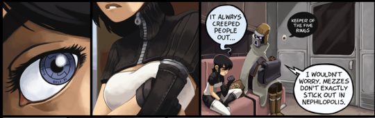
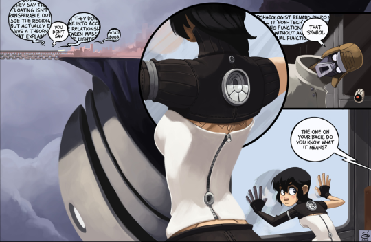
Dresden Codak. Note that the thing we’re supposed to be looking at in panel 2 is the metal ring showing that Kimiko’s arm is a prosthetic, but the camera is pointed at her boobs.
Whereas webcomics with bad art but good writing were good comics.
Dinosaur Comics sets the floor for artistic quality, but is still really liked
Some of this was a bit of jealousy, too. Most people who write reviews of comics are bad at art, and prefer to think of writing, which is the thing they do, as the Primary Driver Of Quality. Then other reason is
Understanding Comics
But the actual fact of a comic is that art is writing, and writing is art. They’re too intermixed to think of as separate skills
Dresden Codak has bad art.
Technically, it’s fine. Hell, technically it’s amazing. If I quit my job and spent 40 hours a week practicing drawing, It would take me years to get to this level. But it’s not functioning. The panels are in a confusing order, and the shot of Kimiko with her back arched way back as if she wanted to make her boobs more prominent in the shot both makes no sense for the scene (compare to the last panel, where she’s leaning forward in a way that makes more sense), and is the wrong type of shot.
The point of that panel is to draw our attention to the symbol on the back of Kimiko’s black crop top thing, but because it’s a medium shot for some reason (so Diaz can draw boobs), there are TWO symbols on her back. The one of the back of her top is center-panel, but there’s a gear symbol peaking out from beneath the top that more literally fits the description of “the one on your back”, especially since we have no reason to think that the silver symbol isn’t part of her shirt. It should’ve been a close up of the symbol! So that we knew which one it was!
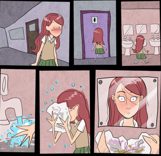
Compare this page in Gunnerkrigg Court. This is technically bad art. I could possibly draw something like this in a day with my current skills. But the deterioration of the drawing quality is good art, because it gives the sense that Annie’s falling apart, which is appropriate to the scene.
Tom Siddel can draw like a motherfucker when he wants to (also this layout is excellent), but for this scene of Annie taking her makeup off, he doesn’t want to, and that’s an artistic choice. A pretty good one, actually.
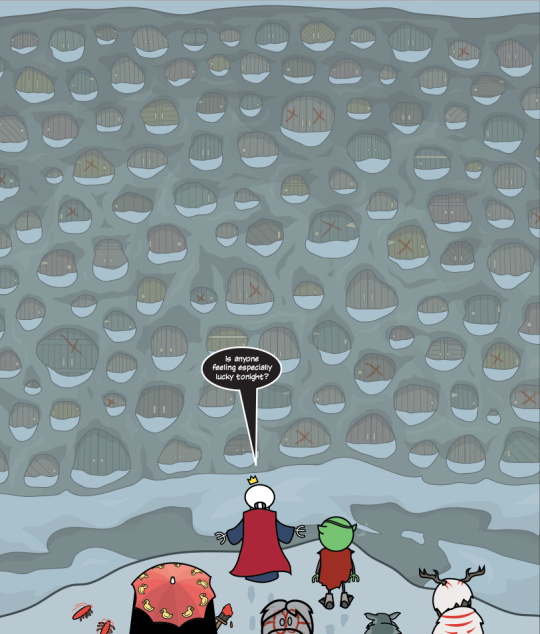
Order of the Stick is one of the simplest comics out there in terms of visual style. This panel isn’t that hard to draw (compared to Unsounded, for instance). But it works.Even if you don’t know anything about OotS, this shot tells you a ton. You understand that these characters have been going through doors at random, and you know that there’s a shitload of doors. Despite it’s simple art style, this panel effectively conveys the scale of the challenge.
None of this requires gimmickry (and sometimes gimmickry is good). You don’t need to be great at drawing to make a panel like that OotS one.
And that’s just basic shot composition! There’s also stuff like the tarot card gimmick you mentioned, color palettes, and visual metaphor.
NSFW
While it’s important to remember films != comics, they can be a good resource for this kind of visual thinking. If I’m filming a scene two people talking, I can “draw” nearly as well as any director, since I have a camera on my phone. The difference between me and a great director (besides budget) is where I point the camera, and what decisions I make.
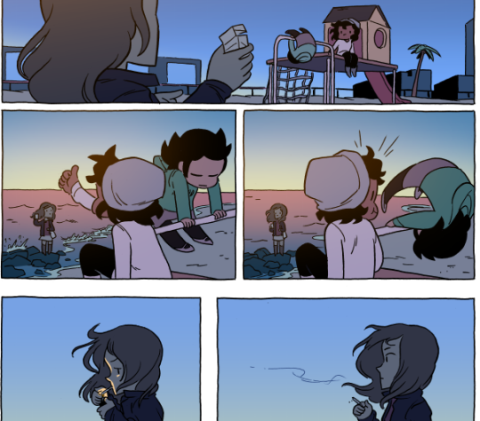
Anyway, here’s a nice set of panels from Octopus Pie, which are great at getting us into Marigold’s frame of mind in a way a good drawing wouldn’t.
Discussion ¬