Please don’t do this
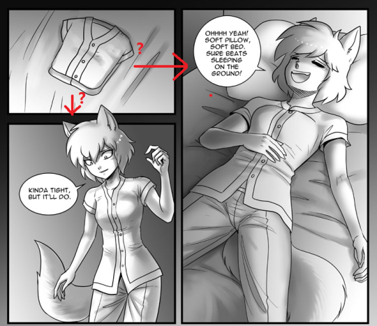
When I read this, I went right instead of down, and got confused for a second, taking me out of the comic. This is literally the textbook example of bad panel layout (assuming your textbook is Understanding Comics), and yet it’s a layout even good webcomics tend to fall into. Probably because it doesn’t look obviously bad at first glance, but this is definitely something to keep an eye out for.
Discussion ¬